INTRODUCING OUR NEW CLUB CREST
- Jun 8
- 2 min read
Today marks the beginning of a new chapter in the visual identity of Brislington FC as we unveil our new club crest.
The redesign follows an extensive process involving club members, staff and volunteers, alongside a detailed research project undertaken by our Art & Design Residency team into the history of the club’s visual language. The result is a crest that carefully references every previous iteration while introducing a renewed identity that reflects who we are today. Rooted in our geographical character and inspired by our independent spirit of forging our own path, the new crest has been designed to honour our past while looking confidently towards the future.
The new crest will be gradually introduced across all club touchpoints over the coming months.
Designer in Residence, Ken Borg, shared insight into the process and thinking behind the redesign:
“Football crests are marks that carry meaning, emotional attachment and historical context, so the brief was not approached lightheartedly.
The new crest balances visual cues that reference and respect previous versions and was based on a lengthy process talking to stakeholders and conducting detailed research, adding nuance rather than removing it for the sake of simplicity or digital usability.
The redesign process was conducted at the request of committee members who felt the club needed to update its visual language at a time of renewal and progression, repositioning the club as a community asset representing the whole of Brislington.
I would like to thank the club for entrusting us with the design process and hope that the new crest can become a symbol that members, fans and players can be proud of.”
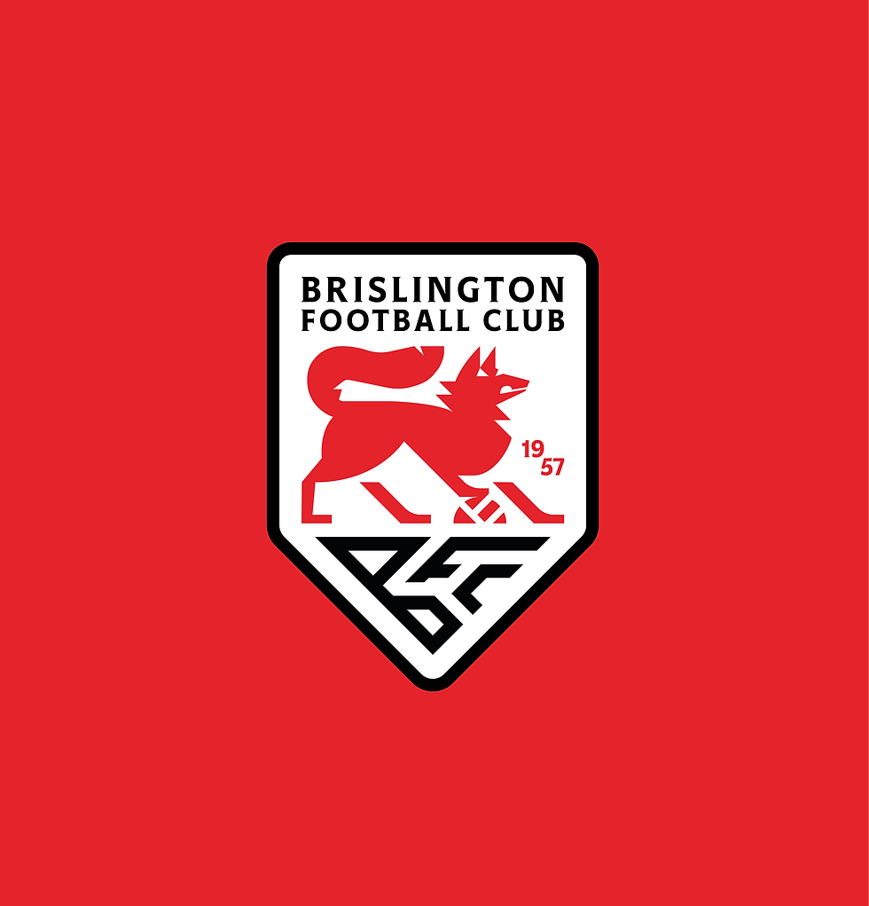
Our New Crest in Detail
A new crest for the future, inspired by the past.
Our new crest combines elements drawn from more than 70 years of visual history. It reflects not only our identity as a football club but also our place within the wider Brislington community and our corner of Bristol.
1. The BFC Monogram
The ‘BFC’ lettering from the club’s first crest has been reimagined to represent the geography of Brislington, referencing the River Avon to the north and its meeting point with Brislington Brook.

2. Three Homes, One Club
The crest acknowledges the three locations the club has called home throughout its history: Arnos Vale Park, Victory Park and Ironmould Lane.
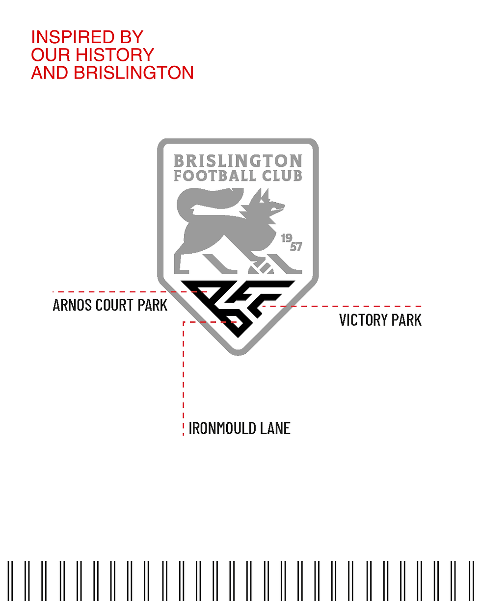
3. The Shield
The overall shield shape draws inspiration from the crest used by the pre-war Brislington AFC and later reintroduced during the 1990s, creating a visual link across generations.

4. The Fox
First added to the club crest during the 1990s and adopted as a nickname over the last two decades, the fox returns in a redesigned, more natural stance. It remains a symbol of the determination, resilience and fighting spirit that define the club.
As we continue to build for the future, we are proud to carry forward the stories, people and places that have shaped our identity. This new crest is not a departure from our history, but a celebration of it.